In this project, I designed two related publications. First a book then a ‘collectable’ type specimen that features and classifies at least one typeface family.
This project aims to make mundane information accessible and graphically interesting through the manipulation of text, composition, colour and graphic elements.
Project 1
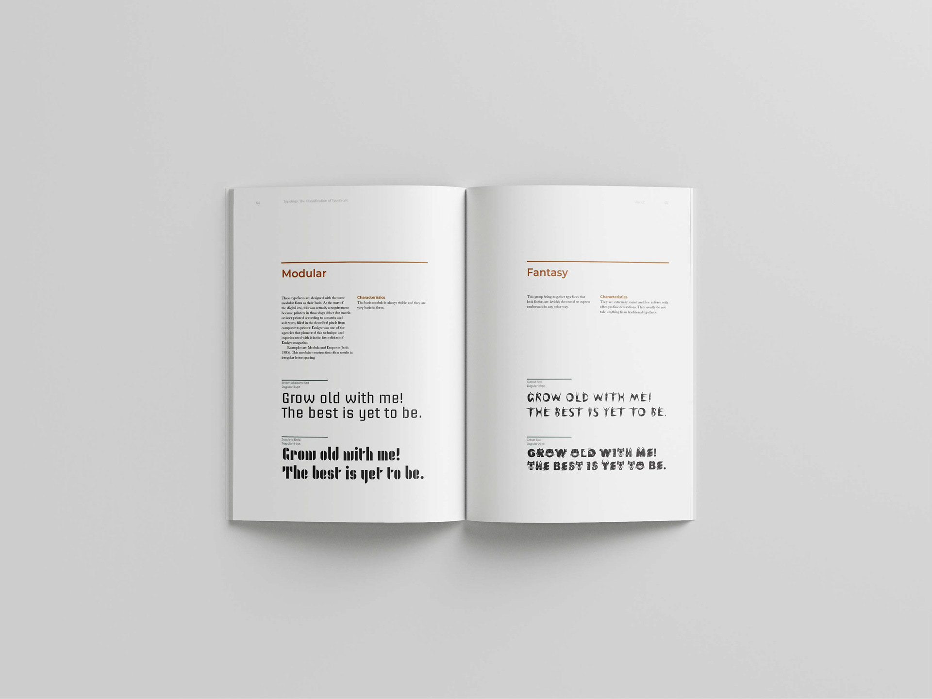
The objective is to design the internal pages of a book. The content will provide conceptual opportunities – these will direct your design decisions and selection of imagery. The format size and text will be provided and a number of levels of typographic hierarchy will be developed for headings, subheadings, body copy, quotes, captions, running headers and folios etc. A grid system will be established for double page spreads and must consider all types of information – it will include margins, columns, gutters, horizontal and vertical alignments, use of white space and placement of illustrations/diagrams and folios. Text should be tested at varying sizes, styles, leading and line length for optimum readability and to develop a visual hierarchy. Information should be clear, accessible and appropriate for the subject matter, with carefully considered typographic detailing of paragraph spacing, rags, widows, orphans and supportive stylistic elements.
Project 2
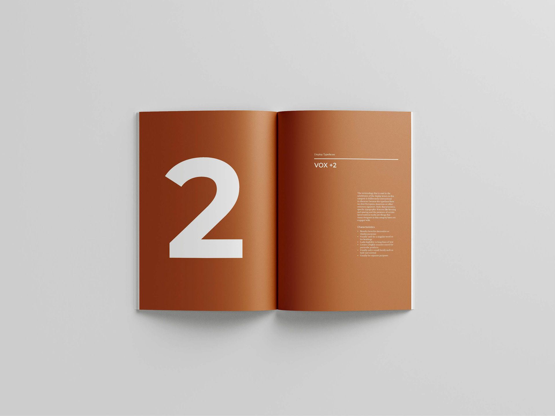
Select, research and report on a contemporary typeface and refer to historical associations or governing visual features of the typeface classification. The binding, format and cover design should respond to an understanding of the subject, the user experience and audience. This typographic artefact is not limited to any size and needs to connect, contain and relate to project 1.
Final
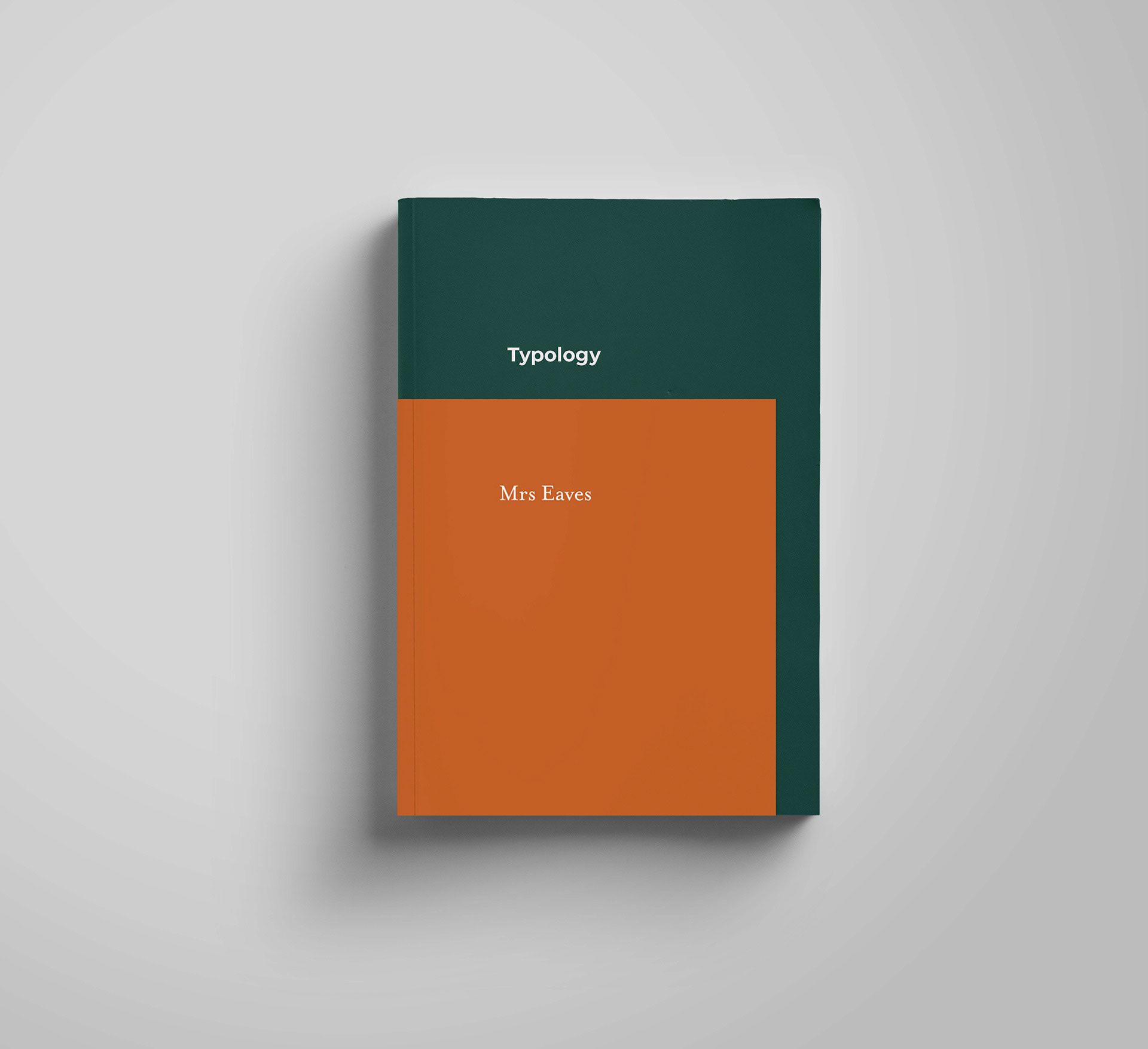
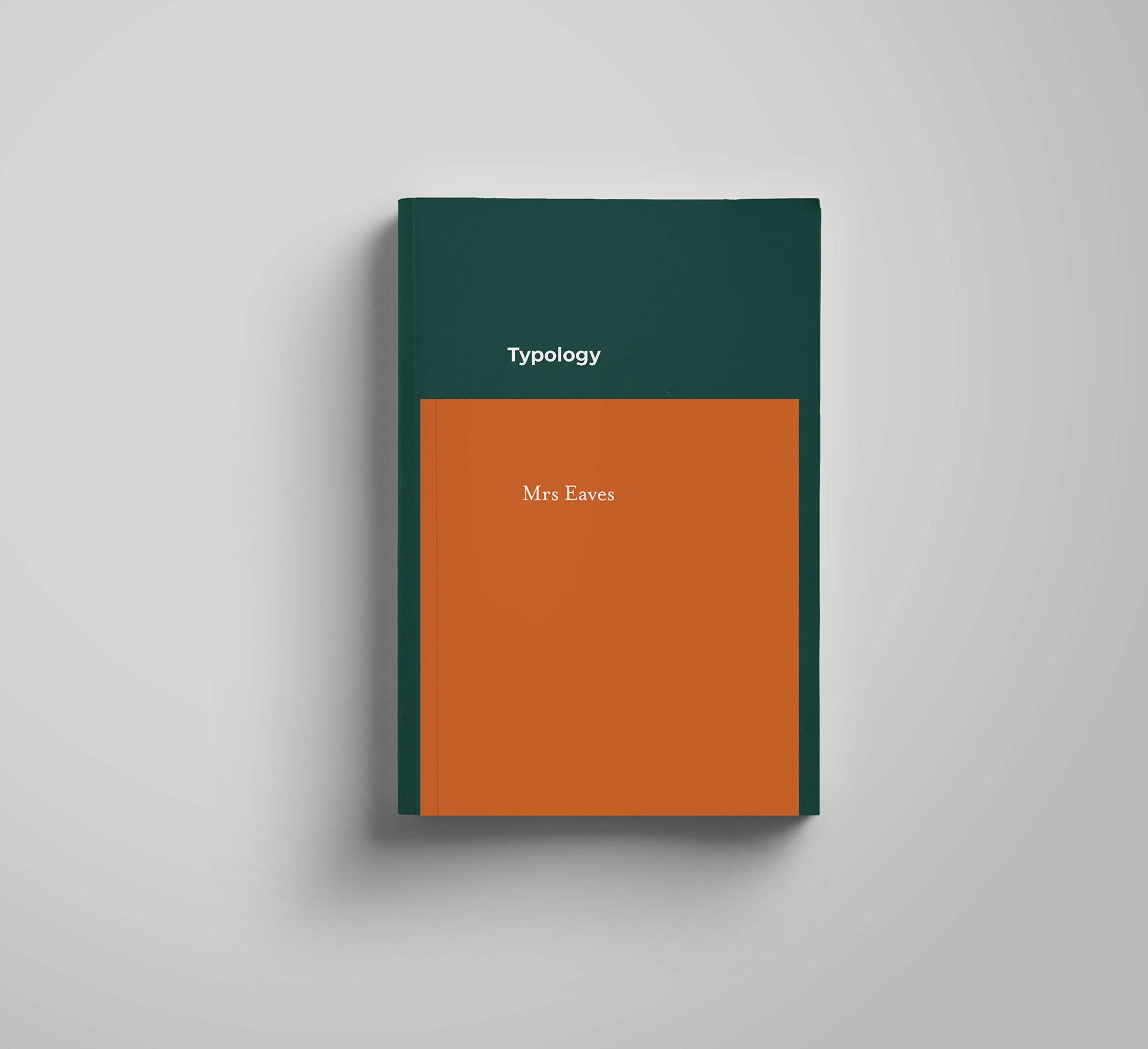
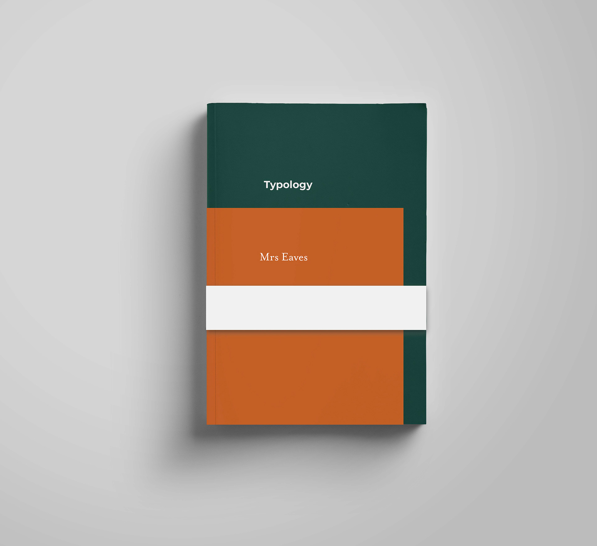
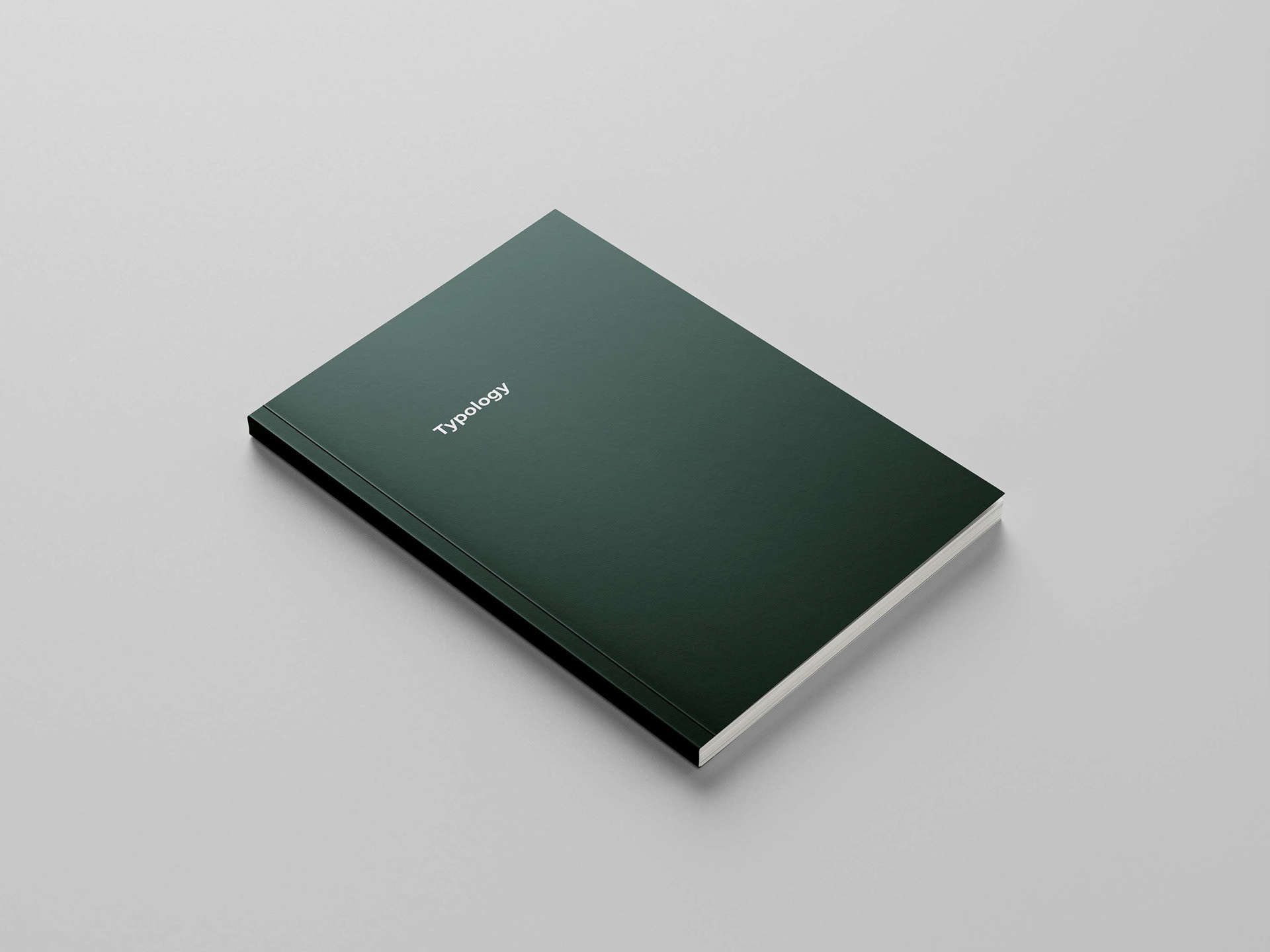
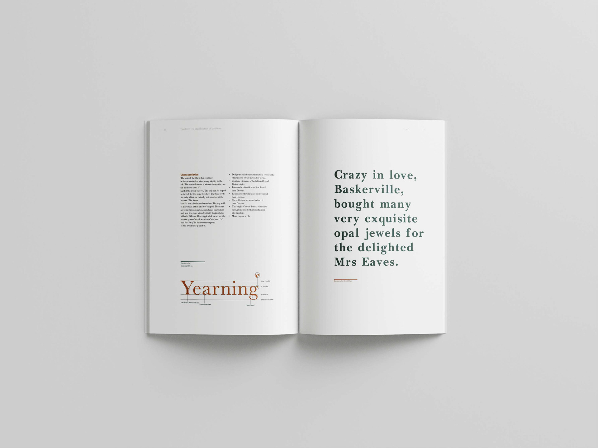
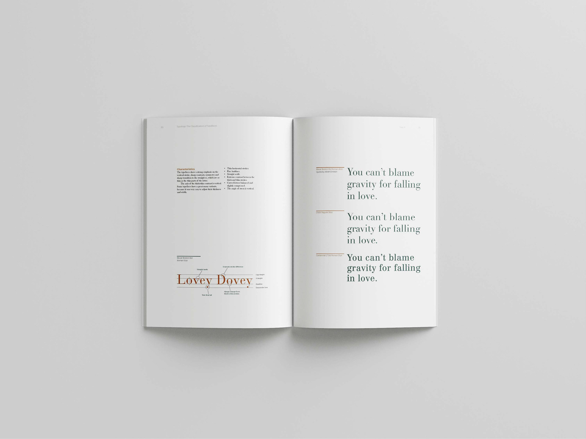
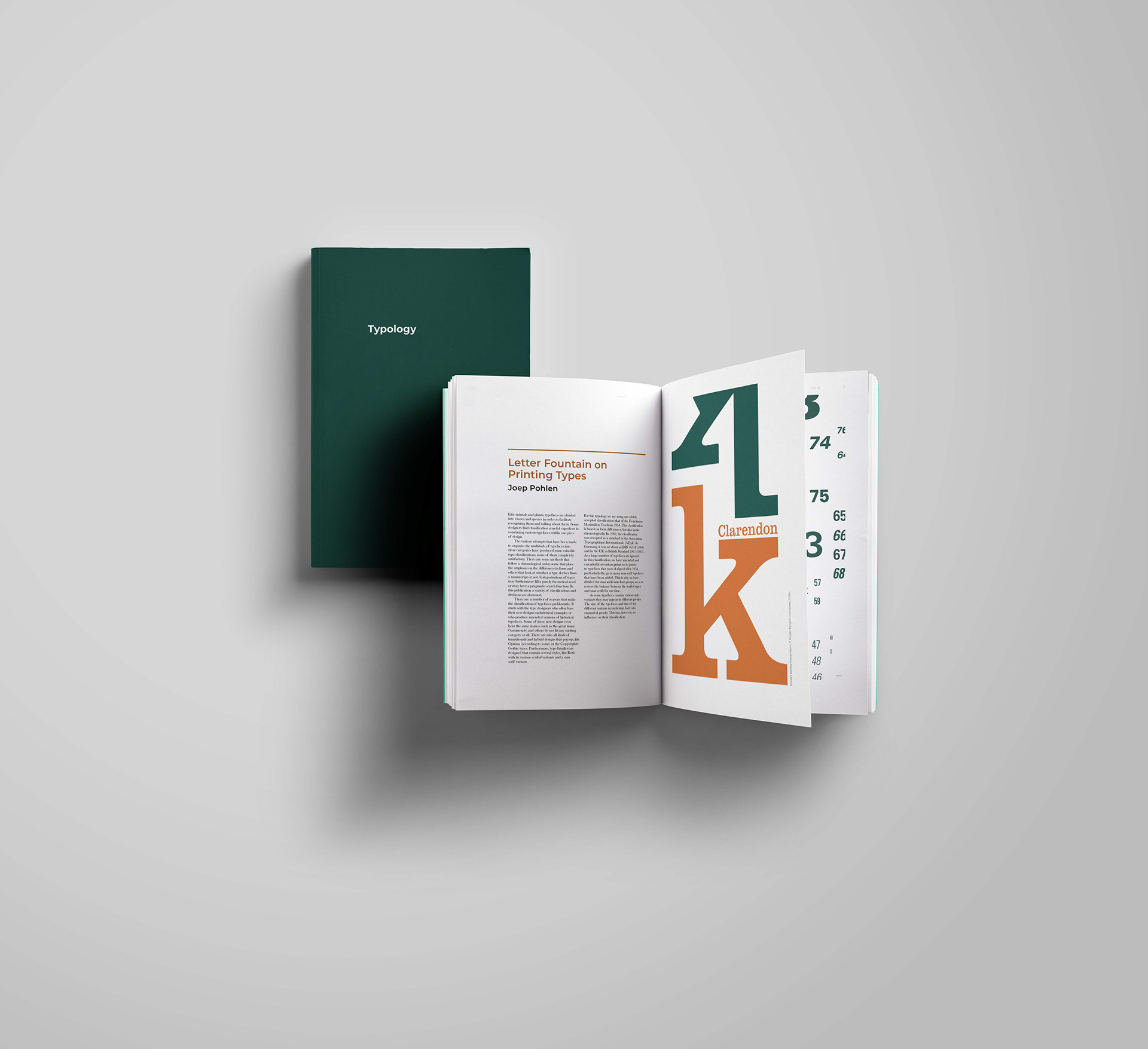
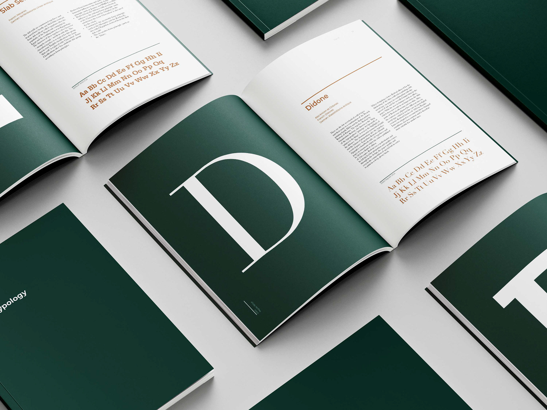
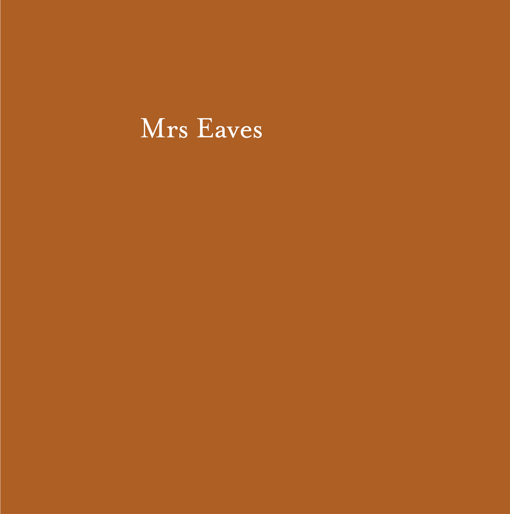
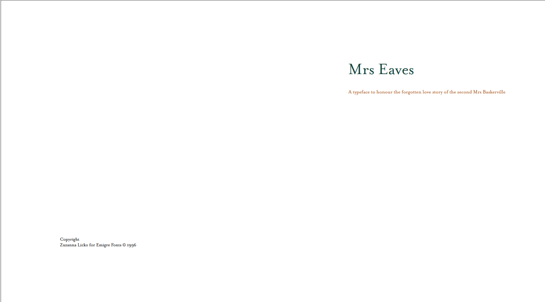
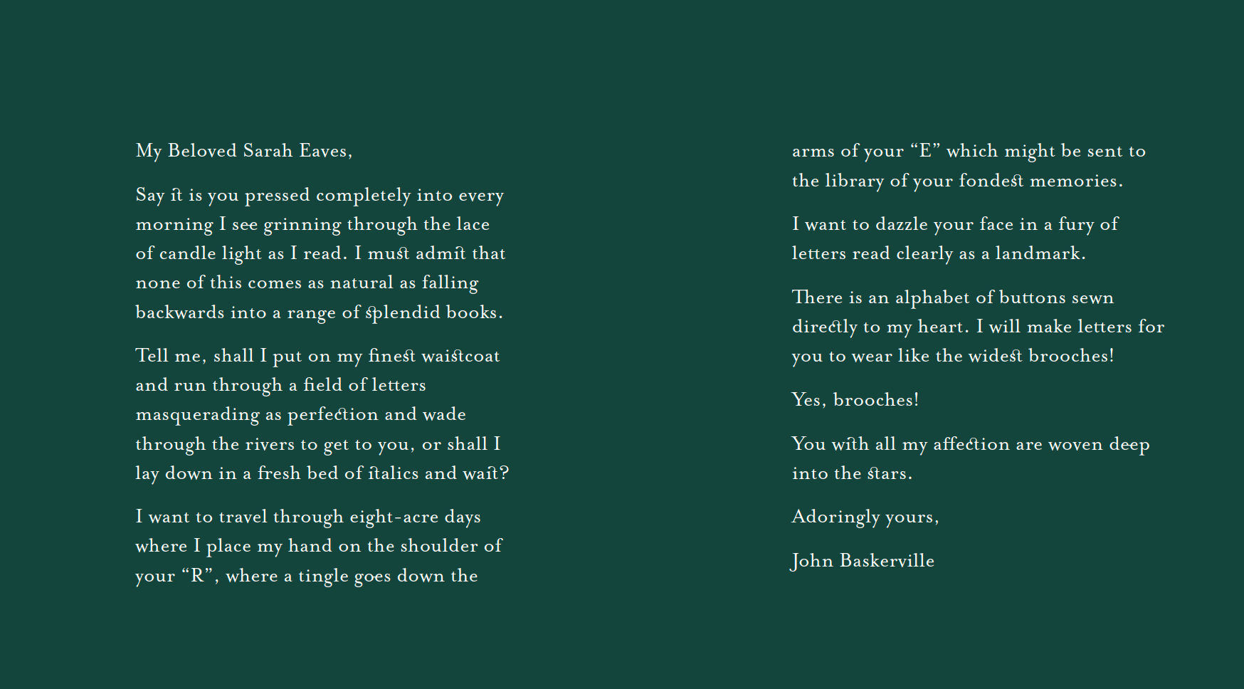
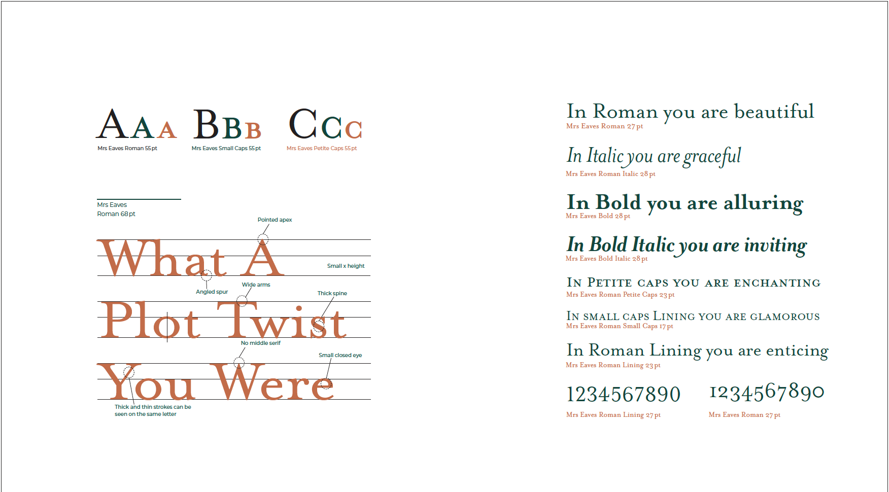
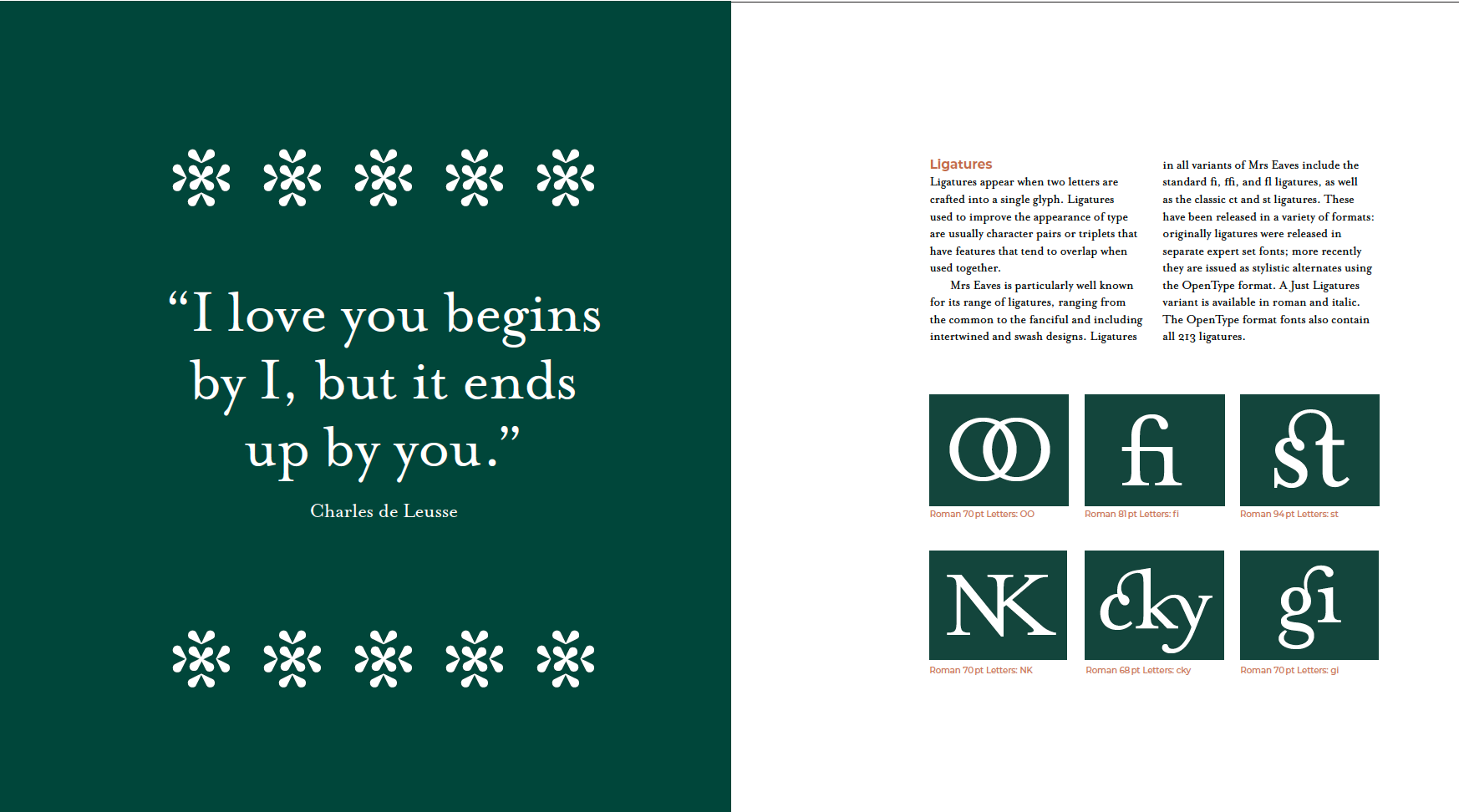
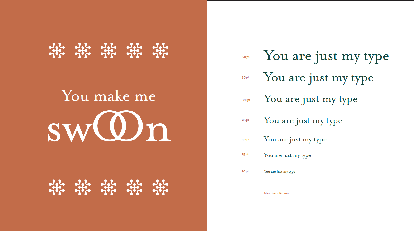
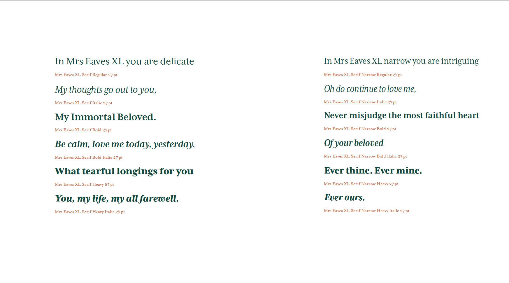
For my Typology Book and Specimen duo I wanted to develop an elegant, classic book that won’t be forgotten. Throughout the Typography books there are quotes and words in relation to romance and love are able to show the different Typography Classifications to show a their characteristics. The romantic elements in the Typology Book play a part into the love story of Mrs Eaves and John Baskerville which is seen in my Specimen. The band that is used to wrap the books together is a symbol for a wedding ring and the life commitment that each Mrs Eaves and John Baskerville wear to show their enteral love.
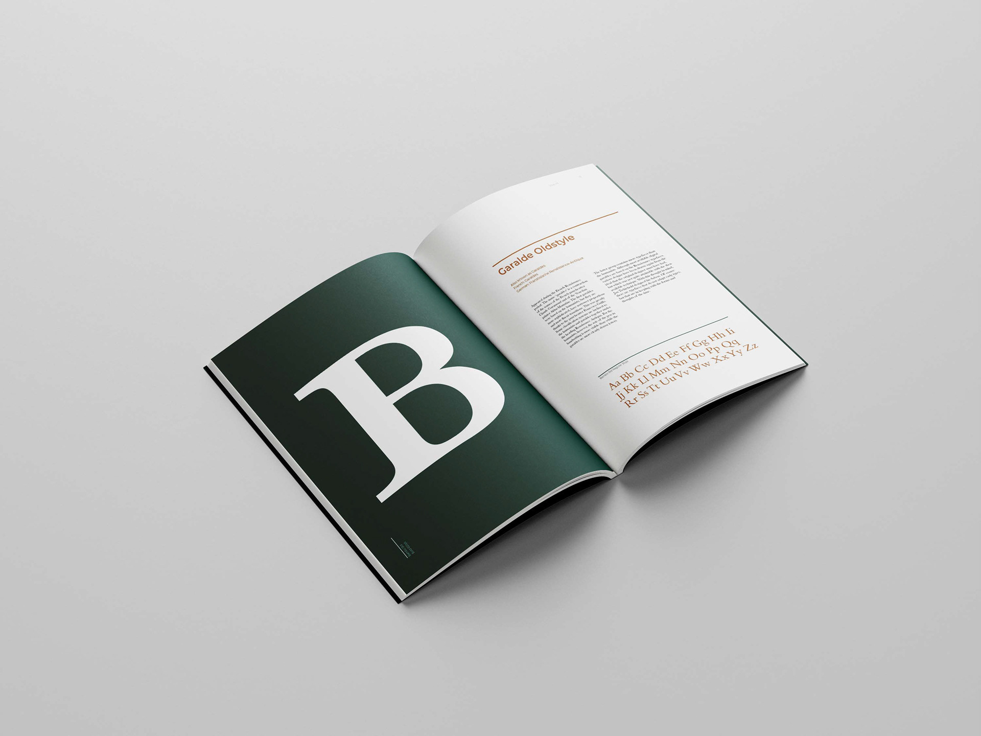
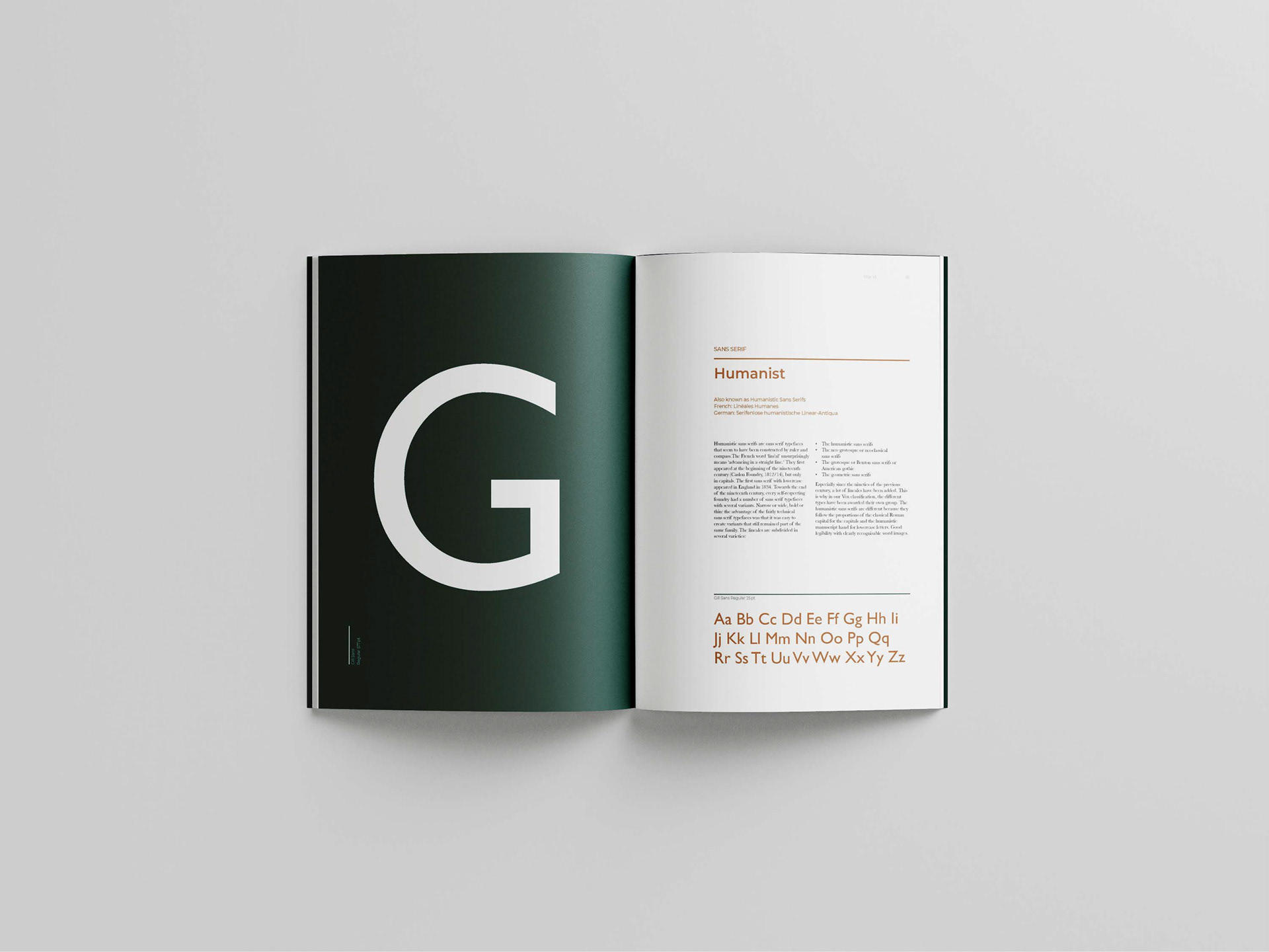
Using an asymmetrical grid, creates a lot of white space throughout allowing the reader to be drawn to the text and being able to see the romantic story throughout. With its timeless, simple cover shows I want it to be relevant in the future, having Mrs Eaves unforgotten for a second time as she made a big impact in the typography world and continues to do so today. Working with green and orange I was able to show the two sides to Mrs Eaves love story, the housekeeper and the designer who also becomes Baskervilles second wife.